 COMMON ISSUES
Text too small on most sites
Text size may look great on your laptop but then switching to the mobile site, a lot of times text renders too small.
Most sites cannot pinch zoom screen
What is worse than small text? You cannot pinch zoom on most mobile web apps which also makes viewing small photos displeasing.
Buttons not sized properly for finger pressing
If you press a menu button 10 times in a row, how often will you miss? This is very common and if you missed at least twice, this could be a poor design, gorilla fingers anyone?
Some desktop features non-existent when using mobile
I viewed a desktop version website that had a 3 panel pricing option but when switched to mobile I got a “Press here to see our prices”. Not much of a big deal, but after performing this step again and again it becomes tedious.
Poor category organization
Some of you have squinted and squandered several minutes trying to find the information you were looking for? Maybe there are too many categories and too many variances on what topics belongs under each.
Non-Compliant to PWA
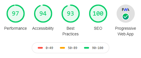
Designing sites as a Progressive Web App (PWA) sets a higher standard. As of today, not even 1% of websites can pass Google’s LightHouse audit. This audit scores points of websites in 5 categories such as Performance, Accessibility, Practices, SEO and PWA.


 The next generation of websites are said to be Progressive Web Apps (PWA). A PWA can be referred to as a native-like “Phone App” that uses your phone’s web browser without downloads or installations. PWA's are high performance with capabilities of viewing the site offline. Other functions include icons on your phone desktop, full screen mode, ability to receive push notifications and also the ability to store data off-line.